Simon’s Search Page – Learning About The Universe Since 2004
 This is a slightly longer post than normal, and goes into some mildly technical software stuff. Hence if you don't care about any of that, and/or don't know the difference between Javscript and HTML, I'm providing a choice of the short or long version.
The Short Version
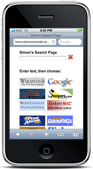
I have a custom home page I made for searching with on my iPhone. It's efficient, user friendly, and I'm proud of it. If you like, you can use it too: www.simoncoronel.com/isearch. (It also works on Android.)
While you can use it on a desktop browser, it's optimised for a small touchscreen interface.
There we go; we're done. Unless you want a long semi-technical saga, you're excused. Go and watch some films or something. I'll understand.
The Longer Version
This is essentially a story about user interface design, and gradually developing your own version of something when the default options aren't good enough. It's also a story about how making something apparently simple can be far more complex than you'd think.
Back in about 2004, Wikipedia was rapidly becoming my favourite website. However, it was annoying to search. If I wanted to learn more about, say, Michel Gondry, I'd have to type "wikipedia.org" in a browser address bar, wait for the page to load, then click on the "English" version, and THEN type in my actual search string. When you're hungry for knowlege several times a day, that can get irritating quite quickly.
The other option was to use Google and search for "site:wikipedia.org michel gondry", but that was a whole extra 18 keystrokes every time I wanted to search, and while "wikipedia michel gondry" or even "wiki michel gondry" would often get the right result, it was far from 100% reliable. Similarly, I'd often be using browsers at work or university that couldn't be set to Google search from the address bar, so in addition to the extra Wikipedia characters, I'd often have to type "google.com" into the address bar, hit enter, and wait for the page to load before typing in my long Wikipedia search string.
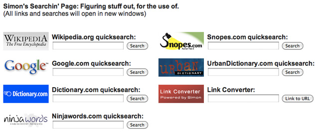
I also found that I was frequently searching Snopes.com and Urbandictionary.com, and since I was at university I was frequently making use of Dictionary.com and its less authoritative but much faster and more charismatic cousin Ninjawords.com.
So one day I sat down, quickly reverse engineered the search interfaces of each of those sites, and made the following page of HTML forms to use as a home page. It looked like this:
Reverse engineering the search interfaces was actually quite a fun challenge. To an experienced software developer it would be relatively trivial, but at the time I was still getting used to how this whole HTML thing worked.
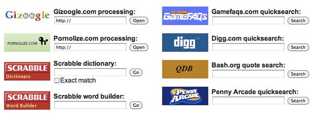
I also coded all the buttons to open the search results in new windows, so that the search page would sit there constantly making my life easer. I even started reverse engineering the search interfaces of other sites I used semi regularly, though many of them were less "important" than the previous sites:
So, for a long time that page worked wonderfully. But, as often happens with user interfaces, a design that seems perfect at first turns out to have some issues that are only apparent once you've been using it for a while.
In this case there were two main problems:
1) If you typed something into one of the text boxes and searched it, the text would still be there next time you came back to the page. Hence for each subsequent search you'd have to manually delete the existing text. Not a big deal, but it becomes annoying when you have to do it multiple times per day.
2) If you searched for something on, say, Wikipedia and no results came up, you'd then have to either copy and paste the search string from the Wikipedia box into whichever other box you were going to try next (eg: Urbandictionary for phrases, Dictionary.com for normal words, Google for everything else, etc). Or you could type it in again. Either way, fiddly and mildly annoying.
Neither problem was a deal-breaker though, and back then I couldn't see any efficient way to solve them. Hence the page stayed pretty much as-is for the next several years, until in 2009 I bought an iPhone 3GS. All of a sudden my beloved search page was glaringly non smartphone friendly. Wonderful though the pinch-and-zoom browsing technology is, it just wasn't enough to make the page convenient on a tiny screen.
So I sat down with a text editor and the source code from a bunch of iPhone-friendly websites and came up with the single-textbox layout that you saw at the start of this article. I was really happy with it. It was simple, clean, immediately intuitive, and way more useful to me than any other iPhone searching interface I'd seen at the time.
The biggest difference was that in order to have multiple search buttons linking to a single input field, I had to use Javascript to invisibly convert the input form into whatever each website's search interface was expecting. If you hack around with how some sites (like Flickr and Snopes in particular) run their searches, there are all kinds of odd data fields that need to be set to apparently arbitrary values for the search to work. When a user hits any of the search buttons, some background Javascript runs a function that converts the search form data into the structure that that site is expecting, and opens the results in a new window.
Eg, for the Flickr Creative Commons search:
clear_hidden_fields();
inputform.method="get";
inputform.action="http://www.flickr.com/search/";
inputfield.name="q";
hidden1.name="l";
hidden1.value="commderiv";
hidden2.name="ct";
hidden2.value="0";
hidden3.name="mt";
hidden3.value="photos";
hidden4.name="adv";
hidden4.value="1";
inputform.submit();
The other benefit of moving to the single textbox layout was that it solves Problem #2 from above - if you search for a term on one website and nothing comes up, it's trivial to come back to the page (where the text will still be sitting in the search box) and hit a button to search for the same string on a different site.
Problem #1 (deleting the text before a new search) was still an issue though, and even more so on an iPhone where you can't just hit Ctrl-A and then Delete the whole field quickly. For a while I tried fixing this by coding another Javascript function to delete the contents of the field immediate after opening the search results window, but then that was just re-enabling Problem #2 again.
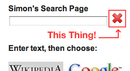
I finally figured out a way to have the best of both words by adding the innocuous red "delete" button next to the search field. It may not look like much, but it's the single element of the UI that I like the most. It's simple, unobtrusive, and gives the best balance of functionality without cluttering up the layout.
So, that's the long complex story behind a relatively simple page. Those of you in software development and/or UI design will know exactly what I'm talking about. For everyone else, keep in mind that keeping something simple is usually much much harder than letting it get complicated.
The reasons behind apparently simple decisions are frequently far more complicated than they may appear on the surface. Software development is hard. Much like science.
Next post: Balloon Art After Dark in Hollywood »
« Previous post: The Chocolate Scale: Why Mediocre Things Still Impress People


This quote came straight to my mind…
“That’s been one of my mantras — focus and simplicity. Simple can be harder than complex: You have to work hard to get your thinking clean to make it simple. But it’s worth it in the end because once you get there, you can move mountains.”
(Steve Jobs, BusinessWeek, May 25 1998)